Creating Dashboards with BI Viewer
The following topics will guide you through the process of creating a dashboard.
When you run an application containing the dashboard designer, it already contains an empty dashboard. To create a new dashboard, click the New button in the ribbon Home tab.
-
Go to Application tab and select Workspaces.
-
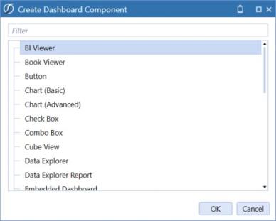
Select Components (in the Workspace Maintenance Unit), then select Create Dashboard Component.
-
Select BI Viewer.
-
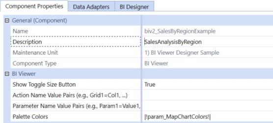
Enter a name: biv2_SalesByRegionExample, description: SalesAnalysisByRegion and select Save.
Adding Dashboard Items
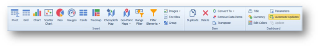
To create a dashboard item in the BI Designer, click the corresponding button in the Home ribbon tab.
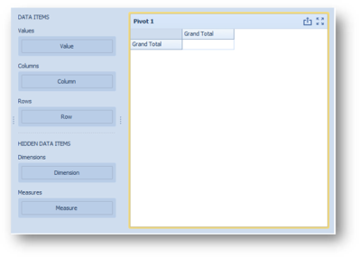
This creates an empty dashboard item and displays the required data sections for binding this item to data (for instance, the image below displays the Pivot dashboard item and corresponding data sections).
Perform the following steps to design a dashboard item:
-
Bind the dashboard item to data.
-
Perform the required data shaping operations (such as grouping, sorting and filtering). Use the interactivity features to enable interaction between various dashboard items.
-
Adjust the dashboard item's position and size and specify the dashboard item caption settings.
-
Specify specific dashboard item settings based on its type. To learn more, see Designing Dashboard Items
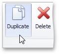
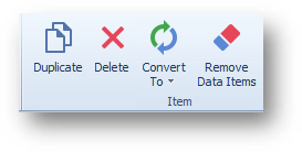
After you have created and designed the dashboard item, you can create an exact copy. To do this, click the Duplicate button in the Home ribbon tab, or use the dashboard item's context menu. To remove the dashboard item from the dashboard, use the delete button or the corresponding item in the context menu.
Binding Dashboard Items to Data
This topic explains how to bind the newly created dashboard item to data source fields, to display data.
Binding Concepts
To bind dashboard items to data in the dashboard designer, the Data Items pane is used.
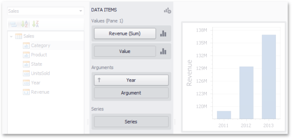
Each dashboard item type has a specific set of data sections, such as values, arguments and series in the chart, columns and sparklines in the grid, and values, columns and rows in the pivot grid. Each data section corresponds to a particular dashboard item area or element and should be mapped to data to be displayed within this area/ element.
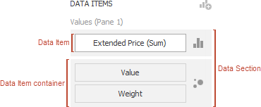
Mapping is performed using data items - objects that are used to bind a dashboard item to data source fields. Data items are used to link the dashboard item to the required data source fields and thus, visualize data within the dashboard item.
Another key concept in data binding is the data item container, which represents a set of data items. It can contain either a single data item or multiple data items, and allows you to specify various options related to how a specific dashboard item visualizes data.
The data item can process data in two ways - as dimensions or measures. This depends on the data section to which the data item is assigned, and the type of the data item container.
These values can be of any type - string, date-time or numeric. In any case, the dashboard does not summarize the dimension values, but groups identical values. You can perform grouping, sorting, or display the top values for the dimension values. You can also customize data format settings for numeric and date-time values. To access the data shaping settings, use the data item's menu button.

For instance, dimensions are used to provide data for the chart argument axis, pivot grid column and row headers.
These values can be of any type - numeric, date-time or string. In any case, the dashboard will calculate an appropriate summary function against measure values. You can also customize the data format settings that affect how summary values are displayed. To access these settings, use the data item's menu button.

For example, measures are used to provide data for the chart's Y-axis, and to calculate pivot cell values.
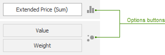
Specific data sections display options buttons for each data item container. Use these buttons to invoke a dialog that allows you to specify the settings of this data item container. These settings affect how a particular dashboard item's area/element displays the provided data.
Data Source Browser
The Data Source Browser allows you to navigate through dashboard data sources. It displays the data source structure and allows you to bind dashboard items to the required data source fields using drag-and-drop operations. The Data Source Browser also enables you to manage calculated fields.
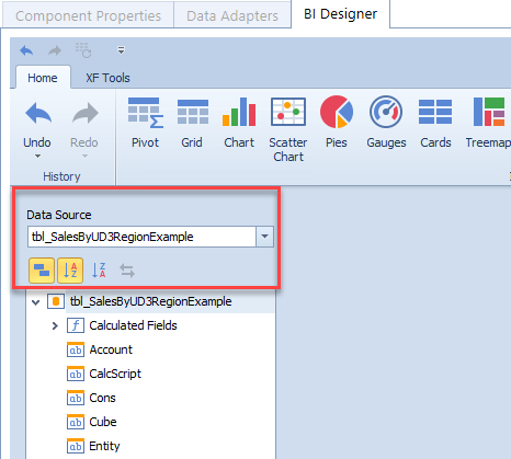
The Data Source Browser contains the following elements:
-
Data Source Drop-Down List: Allows you to select the required data source.
-
Query/Data Member Drop-Down List: Allows you to select the required query or data member.
-
Field List: Displays data source fields. You can drag these fields to the data item placeholders to specify data binding.
The data source browser identifies the following data field types:
| Icon | Description |
|---|---|
|
|
Boolean |
|
|
Byte |
|
|
Date-time |


|
Numeric |
|
|
String |
|
|
Calculated Field |


Data Items Pane
The data items pane is placed side-by-side with the data source browser and allows you to create and modify data binding using drag-and-drop operations.
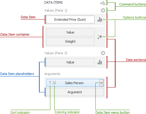
The data items pane can contain the following elements:
-
Data Item Placeholder: Used to create a data binding using drag-and-drop operations.
-
Data Item: Identifies a data binding by mapping to a particular data source field. Each data item has the Data Item menu button, used to invoke a menu that allows you to perform various data shaping operations.
-
Data Section: Corresponds to a dashboard item area or element.
-
Data Item Container: Used to provide data item sets (e.g., for calculating the difference between two measures). Data item containers have Options buttons that allow you to change specific dashboard item settings (e.g., to switch between chart series types or grid column types).
-
Sort Indicator: Shows the current sort order for the data item.
-
Coloring Indicator: Indicates whether coloring by hue is enabled for the data item.
Specific dashboard items have command buttons that allow you to perform various operations, for instance, to add a new pane to the chart dashboard item.
Create Binding
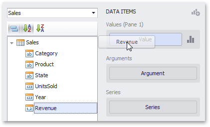
The data items pane displays data sections of the selected dashboard item. It can be used to add, rearrange or remove data items.
To bind a dashboard item to data, select the dashboard item. Then choose the required data field from the data source browser and drop it onto the appropriate section in the data items pane.
You can remove the data item by dragging it outside the data items pane.
To learn how to bind a specific dashboard item to data, see the Providing Data topic for the required dashboard item.
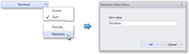
To rename the data item, click its menu button and select Rename.
Modify Binding
You can modify data binding by dragging data item containers within a data section. To do this, drag the data item container to the required position.
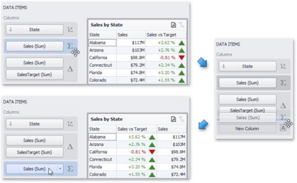
You can also modify data binding by dragging data items within the data items pane. This action has the following specifics:
-
If you drag the data item to a new position, the settings specified for the corresponding data item container will be restored to the default values.
-
If you drag the data item to an existing data item placeholder, the settings of the corresponding data item container will be applied.
Clear Binding
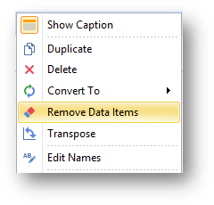
To remove all data items for a selected dashboard item, use the Remove Data Items button in the Home ribbon tab.
You can also do this via the dashboard item's context menu.
Working with Data
The topics in this section describe how to work with data in a connected data source. This section contains the following topics:
-
Filter Queries
-
Pass Query Parameters Stored Procedures Preview Data
-
Creating Calculated Fields
Filter Editor
Filtering can be applied to either underlying or aggregated data.
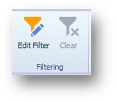
To filter data, click the Edit Filter button in the data ribbon tab, or right-click in dashboard item to bring up the filter editor dialog, which allows you to build filter criteria.
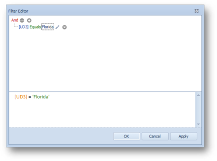
The filter tab allows you to filter underlying data, while the group filter tab provides the capability to filter data aggregated on the server side. In the Filter Editor, you can compare a field value with the following objects:
-
A static value (represented by the
 icon): Click this button to switch to the next item mode ("another field value") to compare the field value with another field value.
 -
An other field value (represented by the
 icon): Click this button to switch to the next item mode (parameter value) to compare the field value with a parameter value.
 -
A parameter value (represented by the
 icon): Click this button to switch back to the initial mode ("static value") to compare the field value with a static value.
When setting a field on the Show Filter Panel Mode property, the filter editors will be displayed as it is set.
Example: The component below has a show filter panel mode field set to Dynamic. In the BI Designer tab, "Grid 1" will not have a checkbox filter button listed at the bottom-left of the section.

See Show Filter Panel Mode for more information.
You can pass the query parameter to the filter string. To do this, click the  button, then click the
  button and finally click <select a parameter>.
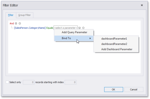
In the popup menu, you can choose from the following options:
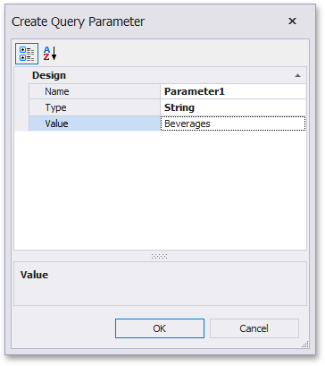
Add Query Parameter: Allows you to create a new query parameter. In the corresponding dialog, you can specify a parameter's name, type, and value. If the current query already contains query parameters, they will be displayed within the popup menu.
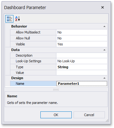
Bind To: Allows you to pass a dashboard parameter to a filter string. You can choose from the list of predefined dashboard parameters or create a new dashboard parameter by selecting Add Dashboard Parameter. If you selected Add Dashboard Parameter, the following dialog will be invoked.
Creating Calculated Fields
The dashboard designer provides the capability to create calculated fields that allow you to apply complex expressions to data fields that are obtained from the dashboard's data source. You can use these fields in data visualizations as regular data source fields. After you have created a data source, you can add a new calculated field based on the existing data source fields.
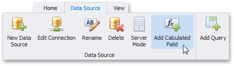
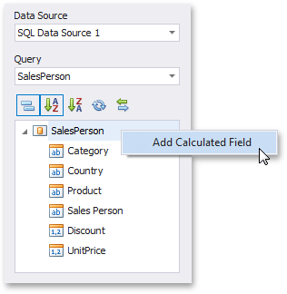
To create a calculated field, select the required data source (and the required query/data member, if applicable) in the data source browser and click the Add Calculated Field button in the ribbon's data source tab, or right-click the field list and select Add Calculated Field in the context menu.
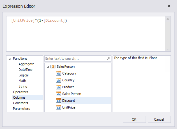
This prompts the expression editor dialog, which allows you to specify an expression that will be used to obtain calculated field values. Here, you can construct the required expression.
You can use the following elements in expressions:
-
Functions
-
Operators
-
Columns
-
Constants
-
Parameters
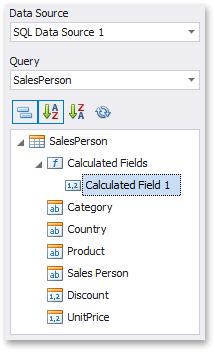
After the expression has been specified, click OK. This displays a new calculated field in the data source structure. Now you can specify the required calculated field type.
Editing a Calculated Field
To edit a calculated field, use its context menu.
This menu contains the following items:
-
Edit Expression: Prompts the expression editor dialog, which allows you to change an expression for an existing calculated field.
-
Field Type: Specifies the type of the calculated field.
-
Rename: Changes the calculated field name.
-
Delete: Removes the existing calculated field from the data source.
Data Processing Errors
The Dashboard Designer provides the capability to display errors that occurred during data processing operations (such as changing measure summary types, calculation errors, etc.). For instance, the grid below shows an error when the summary type of the extended price measure is set to median in server mode.
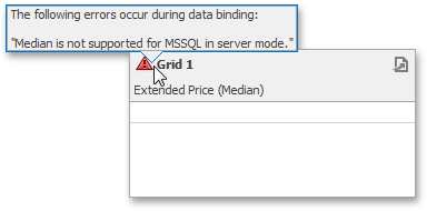
To see the error message, hover the mouse pointer over the  icon.
icon.